
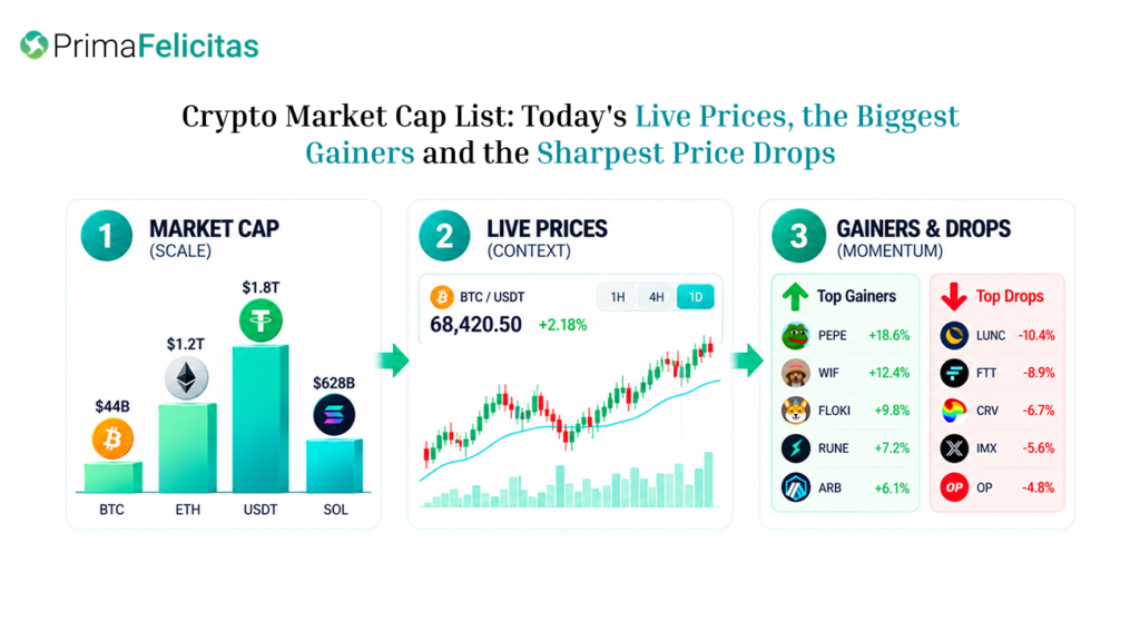
A crypto market cap list gives a quick sense of scale. It does not, by itself, tell a reader whether a project is well run, easy to trade, or likely to perform well. Market capitalization is usually the displayed price multiplied by the supply a data provider counts. Read alongside current prices, movers, and trading activity, the figure becomes a useful starting point for research rather than a shortcut to a verdict.
What a Market Cap List Actually Measures
Market cap is a calculation, not a pile of cash held by the project. Consider two tokens: one trades at $2 with 50 million units counted in supply, giving it a $100 million market cap; another trades at $0.10 with two billion units, giving it $200 million. The cheaper token is the larger one under this method. That small example is enough to show why a low unit price says little about a project’s overall market size.
Supply is where many apparently conflicting lists begin to diverge. One provider may use circulating supply, another may rely on a reported figure, and a third may estimate which locked units are effectively available. Fully diluted valuation adds a future-supply assumption; it is not a statement that every future token is trading today. When rankings disagree, compare that definition before searching for a mistake in the arithmetic.
Size and tradability are separate questions. A token may carry a large reported value while its order book is thin, its spread is wide, or most activity is confined to one venue. A smaller asset may trade more cleanly in the pair a reader actually needs. Market cap sorts the universe; it does not estimate the slippage on a particular order.
How to Read the List With Live Price Context
When opening a crypto market cap list, capture the time, quote currency, displayed price, market-cap field, 24-hour change, and volume. This is a moving dashboard, not a fixed table. A rank can change because the price moved, because the feed refreshed, or because the reported supply changed. A timestamp turns a casual glance into a reproducible observation.
Price and market cap track one another only while the counted supply is stable. If the quote rises while circulating supply is revised, the two percentages will differ. An unlock, burn, migration, or data correction can move a token up or down the table even when the trading pattern looks unchanged. That is why a rank should be read with the supply field beside it.
Quote currency is another easy source of confusion. A token can be flat against one currency and moving against another. Before comparing screenshots, match the pair, time interval, and venue coverage. An aggregate feed may also differ from an exchange’s last trade because it combines venues or uses another reference price. The mismatch may be methodological rather than an error.
Volume helps put the number in context, though it cannot show who is buying or guarantee that an order will fill near the last trade. Add spread and visible depth where they are available. A large-cap row with active turnover and a narrow spread is usually easier to interpret than one supported by very little observable trading. Under stress, however, even a familiar market can become difficult to execute.
Put Gainers and Price Drops in the Same Frame
The crypto gainers today view answers a different question: which assets have recorded the largest percentage advances during the selected window? A small token can lead that table while sitting well below the largest assets by market cap. The two lists are measuring movement and scale, so they can disagree without either being wrong.
The starting point changes the story. A move from $1 to $1.20 is a 20 percent return; a move from $100 to $110 is 10 percent. The second asset may still involve much more traded value and have a deeper book. Compare percentage change with the dollar range, turnover, and spread before calling the first token the more important market event.
The crypto price drop page supplies the downside view a winners-only screen cannot. If a few large assets fall while many small tokens rise, money may be rotating between segments rather than entering the market broadly. If large and small assets are both under pressure, a green pocket may be an exception. Count the names, then check their market-cap weight and turnover so a long list of tiny tokens does not set the whole narrative.
The table can point to a question, but it cannot answer the question on its own. A sharp move might follow an announcement, a listing change, a liquidation cascade, a technical problem, or one isolated print. Trace the original source and see whether comparable venues show the same move. Rank order is a clue, not a causal explanation.
A Practical Market-Cap Reading Workflow
For a market note or a first-pass review, this sequence keeps the comparison grounded:
- Define the field. Note whether the page uses circulating market cap, fully diluted value, or another supply convention.
- Freeze the observation. Save the time, quote currency, price, market cap, 24-hour change, volume, and rank.
- Check the denominator. Look for supply updates, unlocks, burns, migrations, or missing data that could change the calculation.
- Test execution quality. Review spread, visible depth, venue coverage, and whether volume is concentrated in one pair.
- Compare both directions. Read gainers and losers over the same interval, then compare large-cap and small-cap behavior.
- Verify the story. Use a project announcement, filing, technical notice, or other primary document before assigning a catalyst.
- Write the limitation. State the feed’s timestamp, scope, and what the ranking cannot establish.
Here is a useful thought experiment. Asset A has a $500 million market cap, a 6 percent daily gain, and turnover spread across several pairs. Asset B has a $700 million cap and a 12 percent gain, but a wide spread and most of its volume in one thin pair. B looks more impressive in a headline; A may be the cleaner market signal. Neither is a recommendation. The point is that a ranking becomes more informative after a market-structure check.
For editorial work, keep a short source card for every asset mentioned: the displayed fields, page timestamp, reference price if available, and one observation that could disprove the first explanation. This guards against a subtle error—using a later ranking to describe what readers could have seen when the article was first published.
Distinguish circulating value from future supply
Supply events deserve their own line in any comparison. A project may show a modest circulating market cap while retaining a large allocation for future release. Those units may not enter the market soon, but today’s rank will not necessarily describe the same supply base next year. Use the circulating figure for the current snapshot and keep fully diluted value as a separate discussion.
The timing of an unlock can change both sides of the calculation. If new units become tradable while demand is unchanged, market cap may grow more slowly than price—or fall if the extra supply meets selling pressure. Distribution, liquidity, and participant behavior determine the result. A price-only table misses the mechanical change; a diluted-value-only table can overstate what is actually accessible today.
For a neutral article, describe the relationship before offering an interpretation. “The current rank uses circulating supply, while the project reports additional locked units” can be checked. “The unlock will crash the token” is a forecast, not a fact. Burns, migrations, and wrapped assets need the same care because a reported supply change may be technical rather than a simple increase in tradable units.
Place three figures side by side when possible: current market cap, fully diluted value, and 24-hour turnover. The gap between the first two describes future-supply exposure; turnover describes recent activity. Neither number establishes fair value. Showing them together stops a dramatic percentage move from carrying the entire argument.
Limits, Risks, and a Restrained Conclusion
Market dashboards may rely on delayed, estimated, or consolidated data. Prices can move between refreshes, and visible order-book depth can vanish during a volatile minute. Fees, slippage, leverage, liquidation, access rules, and tax treatment are outside a market-cap table. Treat the list as context and confirm current conditions before making a financial decision.
The most defensible reading is comparative. Market cap describes relative scale; live price shows the latest quote; gainers show recent upside; losers show where pressure is appearing. None predicts a future return. Used together, the fields help a reader decide what deserves verification without turning a leaderboard into a substitute for analysis.
FAQ
Is a higher market cap always safer?
No. A larger reported value can coexist with weak liquidity, concentrated ownership, technical risk, or unreliable supply data. Size is one screening dimension, not a safety certification.
Why can two market-cap lists rank the same token differently?
They may use different supply definitions, prices, venue coverage, update times, or treatment of wrapped and bridged assets. Compare methodology before comparing rank.
Should I focus on market cap or price change first?
Use market cap to understand scale and price change to understand recent movement. Then add volume and liquidity; using only one field creates a distorted picture.
Do gainers and losers prove market rotation?
No. They can suggest a pattern worth testing. Confirm it with market-cap weights, sector grouping, turnover, and behavior across comparable time windows.
How often should a market-cap snapshot be saved?
Save it whenever you publish or make a material comparison. A timestamped snapshot preserves the exact context that readers saw and makes later corrections easier.
Go beyond the market cap leaderboard—read live prices, gainers, drops, volume, and supply data together to understand what really matters. Contact PrimaFelicitas to build transparent, data-driven crypto market dashboards.
